For my first parts of experimentation I began by creating packaging and for alcoholic drinks that were aimed at women, I did this by using floral pattens and handwritten type to give it more of a grily feel.
One of the keys to successful commercial design is understanding your audience. If you find yourself working on a design whose target audience will be mostly women, you may need some ideas on how to make it more “feminine.” In commercial design, your concepts should draw the eye of the viewer and strengthen the delivery of a message. For female audiences, a feminine design is more appealing, more effective, and better suited for the purpose.
So, what makes a design feminine? Can you really design something that is naturally attractive to the female eye? With the right fundamentals applied, anyone — even those of the more macho persuasion — can successfully design for a female audience.
Keep in mind that preferences change between different cultures and age groups. For example, we tend to associate bright pinks and purples with very young women, while deeper shades of red and purple are usually chosen for adult women. As with any design, make sure that you have a clear understanding of your audience and keep that specific audience in mind throughout your designing process.
The reason for creating an alcoholic drink aimed at women is because when i was researching in my essay i found that most beer and cider was aimed at men such as , Steller, and we can see this due to its male based packaging.
To create this packaging i made a floral pattern, as flowers often relate to women more than men as they are seen as 'girly'. I also decided to create a floral based packaging as the idea was to create a alcoholic drink that ingredients used flowers. This came as an idea when i researched into cocktails that used Blossoms to create there drink, which is why i choose to create a blossom based pattern & also why I named the drink blossom.
However I decided to change my idea due to the fact that it didn't relate to my essay as well as it could as my essay is based on advertising and commercial adds, into how women are victimised because of this I Decided to create a poster/add.


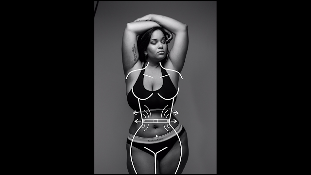
This is my other design which I created as I felt the previous design didn't relate to my essay as well. This idea relates to my essay more as its an awareness poster/ add which I discuss in my essay in the ideas of how women are shown as this fake object and being skinny is how women should be. This poster Is contradicting society and saying that being curvy should be the normal and that having a model figure is not natural, It's aim is to show the public that curvy girls are naturally beautiful to.
I created this by using an image of a curvy women and creating a silhouette on top of the so called 'idolised figure' with arrows pointing out to show you don't need to be skinny like models. I then used the Tag line ' Whats your idea of an ideal women?' as rhetorical question to make people question how they think of model like figures and to realise that curvy women look better than skinny figures.
Overal I think that this design works well as it relates to my essay with the idea of the contradiction of using a curvy women on a front cover rather than a model like figure and it aware people into the fact that the perfect figure doesn't exist and being curvy should be embraced more when it comes to adds/commercials and magazines.


