Geometric sketches
I wanted to create something simple for poster designs so i started to sketch geometric designs, as i thought that they come across quite modernist are simple and clear to understand. These triangles below is what i started out with, this image feels to sharp and to look at is not friendly however it is modernist.

I then began to develop this idea of the geometric shape further and tried to come up with other similar shapes starting to create rounder shapes as rounder shapes come across as more friendly. I think that these designs worked well however i still feel that the designs themselves are cold, possibly because of the thinness of the lines, this is something i'll take into consideration.

I then thought that maybe making a page that was fuller with decoration would make the designs more interesting which slowly began to came interesting. I left negative space due the research which i carried out ealrier and found that modernist posters use negative space also. However I do not think that this works in its favour.

I then tried to create movement within shapes, which would make it more visually interesting i did this by placing symbols in different position to create a patterns. The roundness of these started to become more friendly, however i was unsettled on the pattern and how it linked it settled uncomfortably.

I then started to digitally created some shapes on photoshop, as from research i found that I wanted to create something digitally and traditionally, i started to create individual layers which I thought I could play round with in screen printing.


The reason for the colour choice:
The orange/Red; Is for warmth and a welcoming feel
The pastal blue: To neutralize the heat of the orange
The yellow: To brighten the page and catch peoples eye
Taking into consideration research carried out earlier I found that popular colours which are used in modernist posters are the above, so I figured it would be a creative postive to try do something similar.
Screen printing, I found screen printing difficult, and it is time consuming as i've learnt by carrying it out myself, the screens did not come out the way I would of liked them to, through trail and error I slowly began to get better , however alignment was a constant issue. Overal I am Happy with these screen prints.


I then took these designs digitally further and started editing them on photoshop, however what i found during this process is that the thicker the effect the least I liked it, so I began to keep the design simple, I didn't like that the digital design was taking over the screen print design it communicated a different message. So I began to simplify it down.


From the above designs i then began to create a simplified version and began adding the text bebas neue, choose this font for its boldness and simple design, this font suites well with the background as the background is bright and subtle the text stand outs from the colour of the background.


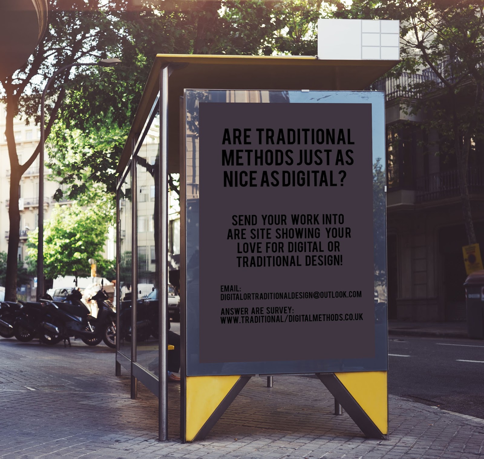
From this I then began to create an advertisement for the website I did this by adding the text bebas neue, this advertisement is to advertise the website which will be created.

I then started mocking up some images for my final photos. Overal I am happy with the results of my posters and think they communicate. Due to them being both traditional and digital, being simple and use a modernist style. If i were to do this again I would take more time screen printing and experiment more with ideas and concepts.


No comments:
Post a Comment